Blog
5 Famous logo rebrands that work
Just like the rest of us, even the best logo needs a little makeover from time to time. Design trends change all the time so unless your brand is a timeless classic, it may need a refresh.
Logo redesign can happen for lots of reasons including: needing to keep up with social media requirements, to start conversations, to cater to customers or because the company has changed its offering.
There’s a risk for brands that don’t refresh their logos, that they’ll run cold after a while, and hit audience blind spots. We’ve pin-pointed some logos that have had a successful refresh, and we think they look great.
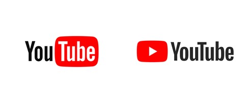
YouTube
After 12 years, YouTube needed a refreshed logo with a flexible design that would work even on the tiniest of screens. The new look is clean and conservative with less emphasis on the word Tube and a focus on a play button icon, which makes it more versatile. The revamped logo means, when space is limited, the brighter logo can be seen more easily.
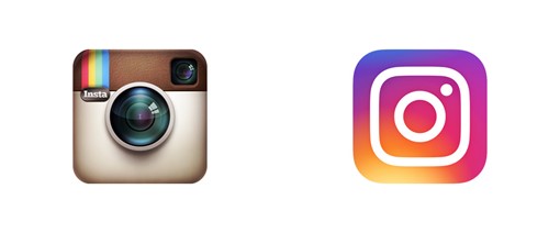
An example of the business model changing and the logo needing to reflect this, is Instagram. Starting life in 2016 as a photo-sharing platform with a polaroid camera icon, it quickly evolved into so much more. According to Ian Spalter, head of Instagram design, when looking at redesigning the logo they asked Instagram staff to draw the current icon from memory in 5 seconds. Almost all of them drew the rainbow, lens and viewfinder. So he knew that these were the iconic elements worth translating into a more modern icon.
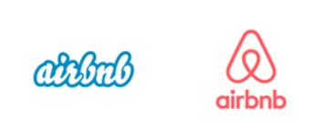
Airbnb
2014 saw Airbnb transform their logo to include a symbol now known as the ‘Belo’. This symbol is intended to convey belonging and was developed by a German design studio. The Belo is an upside-down heart which also looks like the letter A; it represents people, places, love and the ‘A’ of Airbnb.
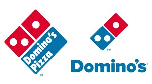
Domino’s Pizza
Domino’s has followed the growing trend for simplifying the amount of text in logos. They dropped the ‘pizza’, which makes sense given their menu has expanded to include a lot more than just pizza. Now the logo often appears without any text at all, and it works because the colours of the brand and the simple design are so recognisable. They say their goal is to be as recognisable as the Nike swoosh or the McDonalds golden arches.
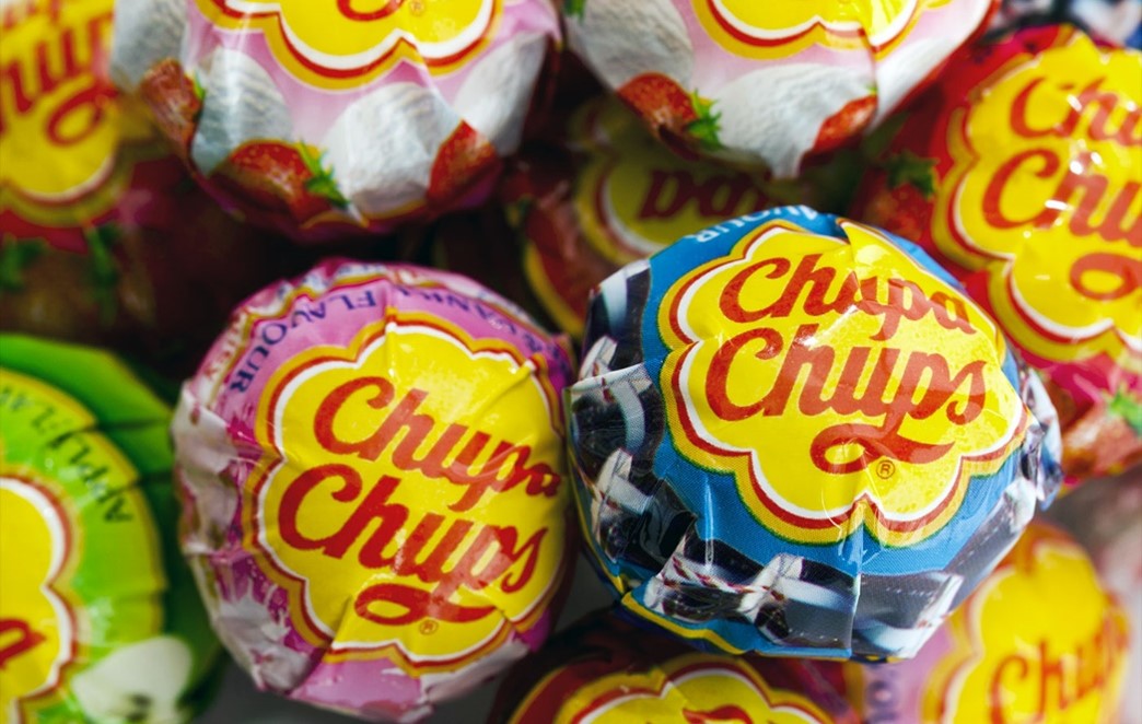
Chupa Chups
Our favourite design logo refresh story goes to Chupa Chups. The founder was friends with Salvador Dali and asked him to help replace an old logo design that he didn’t feel was working anymore. Legend has it, Dali scribbled on an old newspaper in a café and smashed out the design within an hour. Dali insisted that the logo should be displayed on the top of the lollipop so as not to get distorted. A branding master stroke that helped elevate Chupa Chups to a global success story.