10 Common Mistakes to Avoid in Presentation Design
.jpg)
A well-designed presentation can captivate your audience, deliver your message effectively, and leave a lasting impression. But even the best ideas can get lost if your slides are cluttered, difficult to read, or poorly designed. Unfortunately, many presentations fall victim to common design mistakes that distract rather than engage.
In this guide, we’ll highlight the 10 most common mistakes in presentation design and how to avoid them. Whether you’re designing a PowerPoint presentation for a pitch, training, or conference, avoiding these pitfalls will ensure your message is clear, professional, and impactful.
1. Overcrowding Slides with Too Much Content
The Mistake:
One of the most frequent errors is trying to cram too much information onto a single slide. This can overwhelm your audience, making it difficult for them to focus on the key points.
How to Avoid It:
- Stick to the 6x6 rule: No more than 6 words per line and 6 lines per slide.
- Focus on one idea per slide to keep your message clear.
- Use visuals like charts, images, or icons to convey complex ideas instead of lengthy text.
💡 Pro Tip: If you have a lot of information to present, consider breaking it into multiple slides or using handouts to provide additional details.
2. Using Poor Font Choices
The Mistake:
Fonts play a big role in readability and aesthetics, but many presenters use fonts that are too small, hard to read, or unprofessional. Using too many fonts in one presentation also creates a messy, inconsistent look.
How to Avoid It:
- Choose legible fonts like Arial, Calibri, or Helvetica for body text. For headings, use bold sans-serif fonts for emphasis.
- Stick to two fonts throughout the presentation—one for headings and one for body text.
- Use a font size of 24pt or larger to ensure text is legible, even from the back of the room.
💡 Pro Tip: Avoid decorative or script fonts unless they align with your brand and are used sparingly for emphasis.
3. Ignoring Visual Hierarchy
The Mistake:
Slides that lack a clear visual hierarchy confuse your audience because they don’t know where to look first. Poor placement of titles, bullet points, and visuals can make your content look cluttered.
How to Avoid It:
- Use size and contrast to create a hierarchy—titles should be the largest, followed by subtitles and body text.
- Place the most important information at the top or centre of the slide.
- Use bold fonts or accent colours to draw attention to key points.
💡 Pro Tip: Leverage PowerPoint’s alignment and grid tools to create balanced, organised layouts.
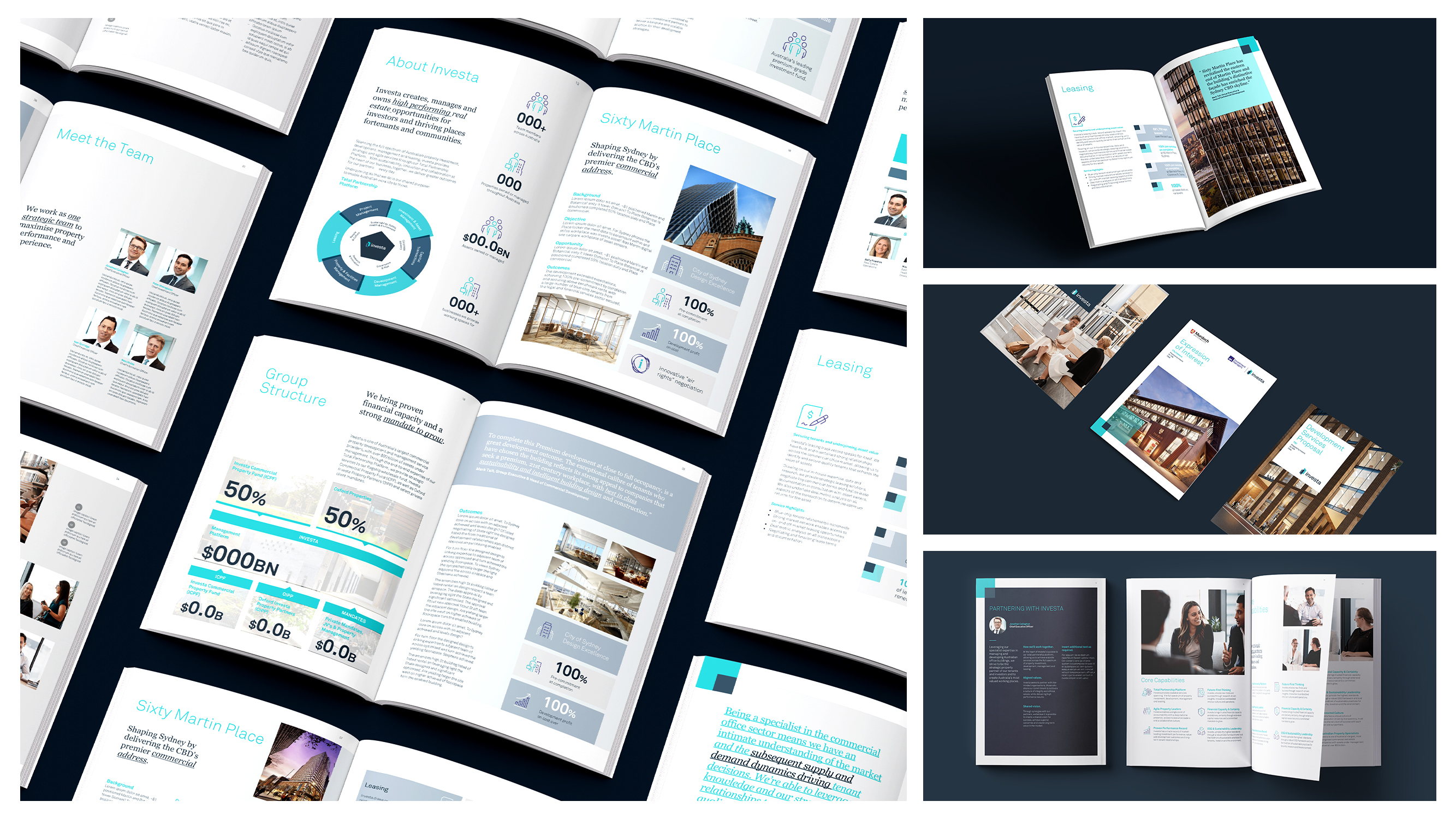
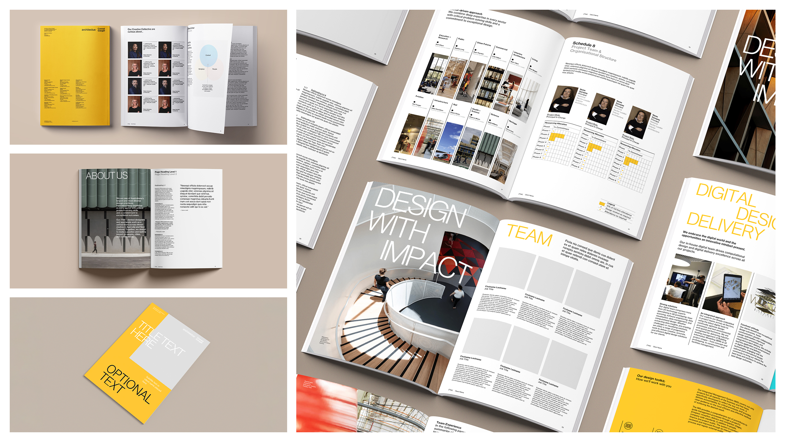
4. Inconsistent Branding
The Mistake:
When your slides lack consistent branding (e.g., mismatched colours, different logos, or multiple font styles), it dilutes your message and makes your presentation look unprofessional.
How to Avoid It:
- Use a branded PowerPoint template with your company’s colours, fonts, and logo pre-built into the design.
- Maintain uniform slide layouts across the entire presentation.
- Limit your colour palette to 2-3 brand colours for a cohesive look.
💡 Pro Tip: Save time by using PowerPoint’s Slide Master to set up consistent layouts and branding for all slides.
5. Overusing Bullet Points
The Mistake:
While bullet points are useful for organising information, relying on them too much can make your presentation dull and visually unappealing. Bullet-heavy slides often feel more like reading material than a presentation.
How to Avoid It:
- Replace bullet points with visuals, like icons, images, or infographics, to convey your message.
- Use short phrases or single words instead of full sentences.
- Highlight the main takeaway in a bold heading and provide additional context verbally.
💡 Pro Tip: PowerPoint’s SmartArt feature can transform bullet points into more dynamic visuals.
6. Misusing Colours
The Mistake:
Using too many colours, clashing hues, or text colours that don’t contrast well with the background can make slides difficult to read and visually jarring.
How to Avoid It:
- Stick to your brand colours, but incorporate complementary shades for variety.
- Use high-contrast colour combinations, such as dark text on a light background or vice versa.
- Avoid using neon or overly bright colours that strain the eyes.
💡 Pro Tip: Use tools like PowerPoint’s Colour Picker or online resources like Coolors to build a harmonious colour palette.
7. Ineffective Use of Charts and Graphs
The Mistake:
Data visualisation is a powerful tool, but poorly designed charts and graphs can confuse or bore your audience. Overcrowded charts, irrelevant data, or lack of context can reduce the impact of your message.
How to Avoid It:
- Choose the right chart type: Use bar charts for comparisons, line charts for trends, and pie charts for proportions.
- Simplify your visuals by removing unnecessary gridlines, labels, or colours.
- Highlight key data points with bold colours or callouts.
💡 Pro Tip: Use PowerPoint’s Chart Design tools to customise charts and make them visually engaging without overloading them.
8. Ignoring Accessibility
The Mistake:
Failing to design slides with accessibility in mind can alienate parts of your audience. Common mistakes include small text, low colour contrast, or slides that rely too heavily on visuals without context.
How to Avoid It:
- Use alt text for images so that screen readers can describe them for visually impaired users.
- Ensure a minimum contrast ratio of 4.5:1 between text and background.
- Avoid colour-only distinctions—use labels or patterns to differentiate data points in charts.
💡 Pro Tip: Use PowerPoint’s Accessibility Checker to identify and fix accessibility issues before presenting.
9. Overusing Animations and Transitions
The Mistake:
While animations and transitions can make your slides more dynamic, overusing them can make your presentation feel amateurish or distracting.
How to Avoid It:
- Use simple, professional transitions like Fade or Push. Avoid gimmicky effects like "Bounce" or "Spiral."
- Apply animations sparingly and consistently—use them to emphasise key points, not every element on the slide.
- Stick to one transition style throughout the presentation.
💡 Pro Tip: PowerPoint’s Morph Transition is a subtle, professional effect that creates seamless slide changes.
10. Forgetting the "Big Picture"
The Mistake:
A beautifully designed presentation means little if it doesn’t deliver a cohesive, compelling story. Forgetting to structure your content around a clear narrative can leave your audience confused or disengaged.
How to Avoid It:
- Start with an outline: Identify your key message, supporting points, and conclusion before designing your slides.
- Use storytelling techniques like the three-act structure: introduce the problem, provide the solution, and end with a strong call-to-action.
- Make sure each slide supports your overall message rather than just providing isolated pieces of information.
💡 Pro Tip: Use your first and last slides to reinforce your key message for maximum impact.
Conclusion
Avoiding these common mistakes in presentation design is the key to delivering slides that are not only visually appealing but also effective in communicating your message. By focusing on simplicity, consistency, and storytelling, you can create presentations that engage, inform, and inspire your audience.
Need help designing professional, branded PowerPoint templates that eliminate these pitfalls? Ideaseed.com.au specialises in crafting bespoke presentations and templates that ensure your slides are polished, on-brand, and impactful every time.
FAQs
1. What is the most common mistake in presentation design?
The most common mistake is overcrowding slides with too much text or data. Simplicity is key to keeping your audience engaged.
2. How can I make my presentations more visually appealing?
Use consistent branding, high-quality visuals, and clean layouts. Incorporate icons, charts, and colour schemes to add polish without overwhelming your audience.
3. How do I ensure my slides are accessible to everyone?
Use high-contrast text, add alt text to images, and avoid relying solely on colour to convey meaning. PowerPoint’s Accessibility Checker can help identify issues.
4. Should I avoid animations altogether?
Not necessarily. Use animations sparingly and with purpose—for example, to reveal key points or guide attention to important visuals.
5. How do branded templates help with presentation design?
Branded templates provide a consistent foundation with pre-set fonts, colours, and layouts, saving time and ensuring your presentations look professional.
RAVE REVIEWS
who we work with


.svg)
.svg)
.svg)
.svg)


%20(2).avif)


.svg)