The Science of Presentation Design: How to Captivate Your Audience in Seconds

Creating a PowerPoint presentation that captivates your audience is both an art and a science. With attention spans shrinking and information overload at an all-time high, it’s critical to design presentations that instantly grab attention and leave a lasting impression. But what’s the secret to achieving this?
The answer lies in understanding the psychology behind effective presentation design. By tapping into visual hierarchy, font psychology, and data visualisation techniques, you can craft slides that not only communicate your message but also engage your audience on a deeper, cognitive level.
Let’s dive into the science of presentation design and discover how to captivate your audience in just a few seconds.
1. The First Impression: Why the First Few Seconds Matter
Research shows that audiences form an impression of your presentation within the first 7 seconds. This means your opening slide and initial moments are crucial to establishing credibility and capturing attention.
Tips for a Strong First Impression:
- Create a bold opening slide: Use an impactful image or a thought-provoking question to draw people in.
- Use minimal text: Overloading your opening slide with text can cause your audience to disengage immediately.
- Leverage contrast: Pair bold fonts with a clean background to make your message stand out.
💡 Example: Instead of starting with your company logo, open with a striking image or statistic that sets the tone for your presentation.
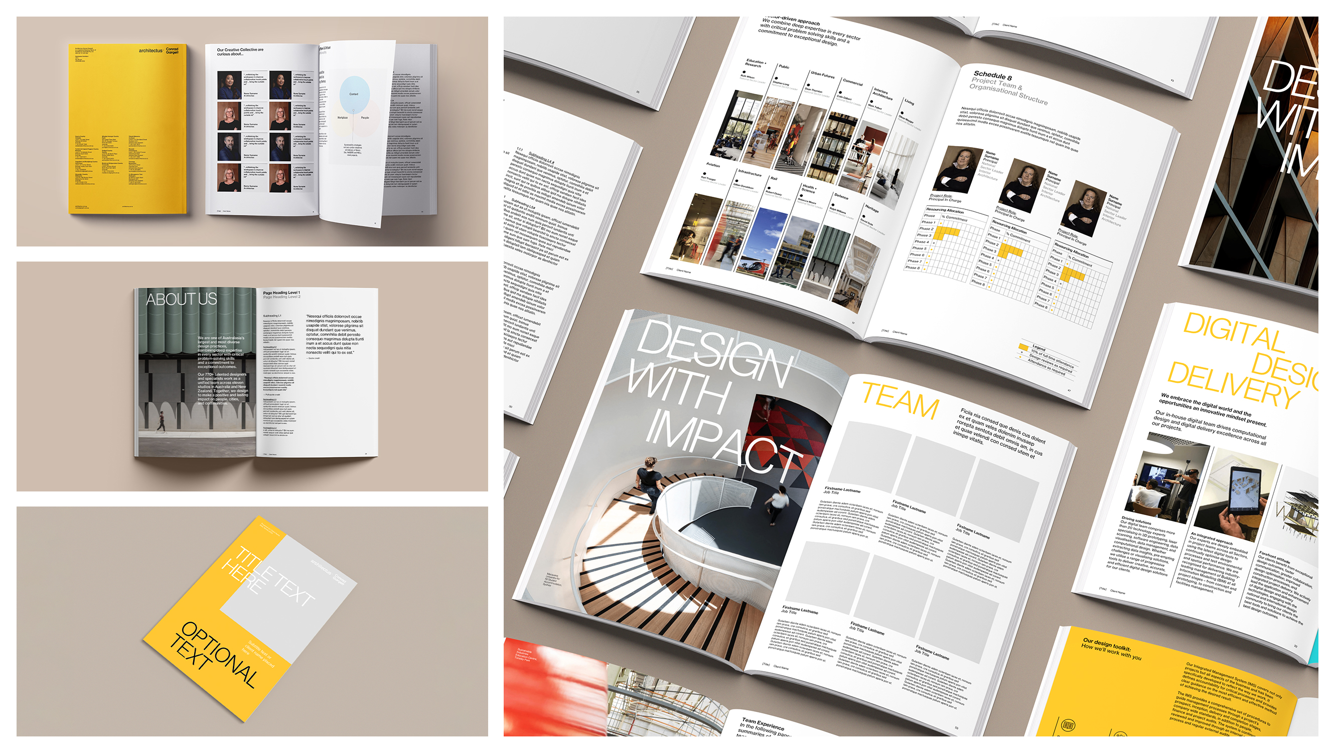
2. Understanding Visual Hierarchy: Guiding the Eye Naturally
Visual hierarchy refers to the arrangement of design elements in a way that guides the viewer’s eye through the content. When used correctly, it ensures that your audience processes information in the intended order, from the most important point to the least.
How to Create a Strong Visual Hierarchy:
- Size Matters: Larger elements, like titles or key statistics, grab attention first.
- Use Contrast: Dark text on a light background (or vice versa) ensures readability and draws focus.
- Positioning: Place the most important information at the top or centre of your slide, where the eye naturally lands.
💡 Pro Tip: Use Microsoft PowerPoint’s gridlines and alignment tools to organise elements symmetrically, making your slides visually appealing and easier to follow.
3. The Power of Font Psychology
Fonts do more than just display text—they evoke emotions, set the tone, and influence how your message is perceived. Choosing the right font for your presentation is critical to establishing credibility and communicating effectively.
Key Principles of Font Psychology:
- Serif Fonts (e.g., Times New Roman, Georgia): Traditional and professional; ideal for formal presentations like reports or proposals.
- Sans-Serif Fonts (e.g., Arial, Calibri): Modern and clean; great for tech-related or creative content.
- Display Fonts (e.g., Impact, Lobster): Bold and attention-grabbing; best used sparingly for headlines or key points.
💡 Pro Tip: Limit yourself to two fonts per presentation—one for headings and one for body text. Consistency reduces cognitive load and keeps the audience focused on your message.
4. The Role of Colour Psychology in Captivating Your Audience
Colours have a profound psychological impact, affecting emotions, perceptions, and behaviours. Using the right colour palette in your presentation can help convey your message more effectively.
Common Colour Associations:
- Blue: Trust, reliability, and professionalism. Ideal for corporate presentations.
- Red: Energy and urgency. Great for emphasising critical points.
- Green: Growth and harmony. Works well for environmental or financial topics.
- Yellow: Optimism and creativity. Perfect for presentations focused on innovation or ideas.
💡 Pro Tip: Use your brand colours to maintain consistency, but incorporate complementary colours for emphasis. Microsoft PowerPoint’s Colour Picker Tool can help you find a balanced palette.
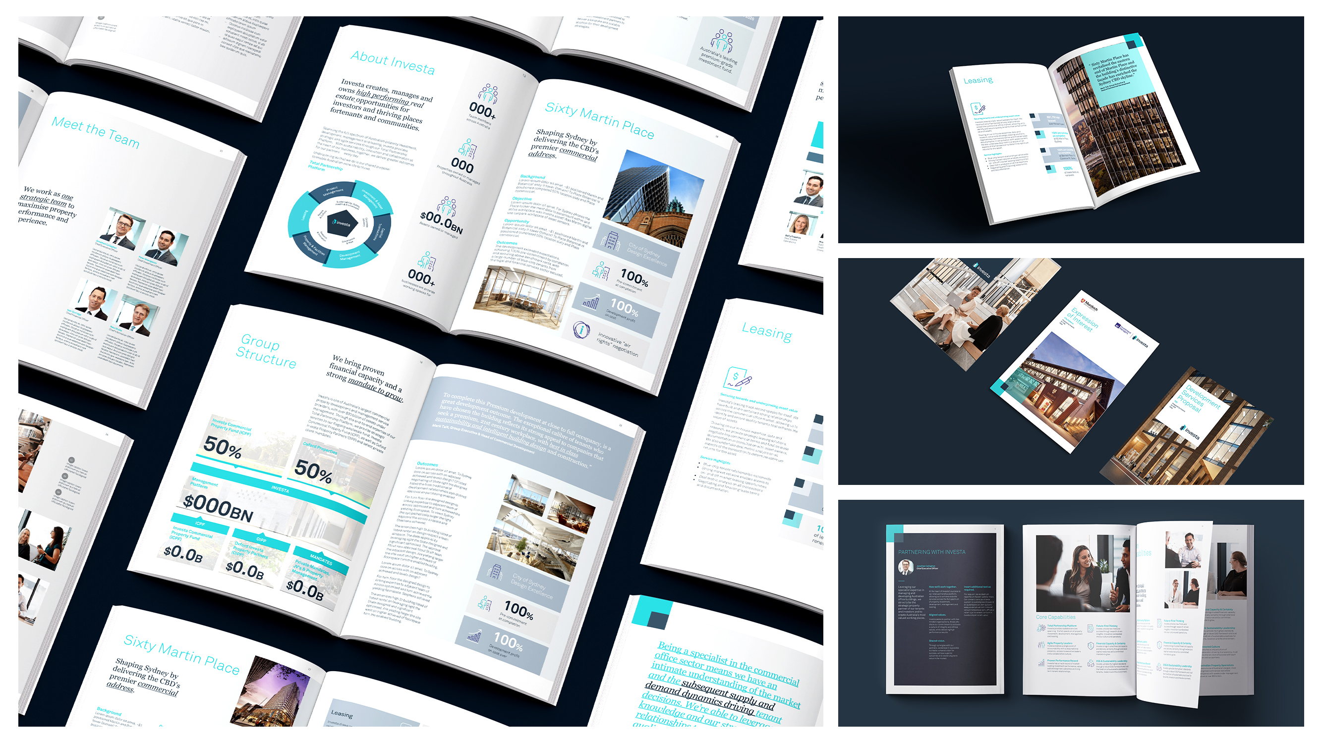
5. Data Visualisation: Turning Numbers into Stories
When it comes to data, visuals are far more effective than raw numbers. According to studies, people process visuals 60,000 times faster than text. The key is to turn complex data into clear, engaging visuals.
Best Practices for Data Visualisation:
- Simplify Your Charts: Avoid cluttered charts and focus on one key takeaway per visual.
- Use Contrast and Colour: Highlight important data points with bold colours to draw attention.
- Choose the Right Chart Type:some text
- Bar Charts: Compare quantities across categories.
- Pie Charts: Show proportions or percentages.
- Line Charts: Visualise trends over time.
💡 Example: Instead of presenting a table full of numbers, use a bar chart to show year-over-year growth, with the most recent year highlighted in a standout colour.
6. Storytelling Techniques: Engage Emotions, Not Just Logic
People remember stories far better than facts or figures. Integrating storytelling into your presentation design helps create an emotional connection with your audience, making your message more memorable.
How to Incorporate Storytelling:
- Start with a problem or challenge your audience can relate to.
- Present your solution or idea as the hero of the story.
- End with a strong resolution that ties back to your audience’s needs.
💡 Pro Tip: Structure your presentation using the three-act format: setup, conflict, and resolution. Use PowerPoint’s Morph Transition to create smooth, cinematic visuals that align with your story.
7. Minimalism: Less Is More
A common mistake in presentation design is overcrowding slides with text and visuals. Minimalist designs are not only visually appealing but also help the audience focus on the core message.
How to Keep It Minimal:
- Stick to the 6x6 rule: No more than six words per line and six lines per slide.
- Use icons or images to replace text where possible.
- Focus on one idea per slide to avoid overwhelming your audience.
💡 Pro Tip: Use PowerPoint’s Designer Tool to automatically generate clean, professional layouts based on your content.
8. Gestalt Principles: How the Brain Organises Visual Information
Gestalt psychology explains how people perceive and organise visual elements. Incorporating these principles into your presentation design can help your audience process information more effectively.
Key Gestalt Principles for Presentation Design:
- Proximity: Group related elements together to show they are connected.
- Similarity: Use consistent fonts, colours, or shapes to indicate related content.
- Figure-Ground: Create contrast between your content (figure) and the background (ground) to make important elements stand out.
💡 Example: Group bullet points closer together to visually link them, and separate unrelated content with white space.
9. Movement and Animation: Engaging Without Distracting
When used strategically, animations and transitions can help guide the audience’s attention and enhance storytelling. However, overusing them can make your presentation look unprofessional.
Best Practices for Animations:
- Use fade-ins or slide-ins to introduce content progressively.
- Keep transitions between slides simple and consistent (e.g., "Fade" or "Push").
- Avoid distracting effects like spinning text
💡 Pro Tip: PowerPoint’s Morph Transition allows for smooth, professional movement between slides, perfect for storytelling or data comparisons.
10. The Importance of White Space
White space, or negative space, is the empty area around design elements. It gives your content room to breathe and helps your audience focus on what’s important.
How to Use White Space Effectively:
- Avoid crowding text and visuals. Leave ample space between elements.
- Centre your main content to create a clean, organised look.
- Use margins and padding to balance your slide design.
💡 Pro Tip: Don’t be afraid of empty slides! A single word or image on a slide can be incredibly impactful when surrounded by white space.
Conclusion
The science of presentation design is all about leveraging psychological principles to engage your audience, simplify complex ideas, and make your message memorable. By applying concepts like visual hierarchy, font psychology, and data visualisation, you can create PowerPoint presentations that captivate your audience from the very first slide.
Remember, a successful presentation isn’t just about what you say—it’s about how you make your audience feel. Use these strategies to design slides that leave a lasting impact, and if you need expert help, the team at Ideaseed can craft bespoke PowerPoint templates tailored to your brand and goals.
FAQs
1. How can I simplify data visualisation in PowerPoint?
Use clean, easy-to-read charts and focus on one key insight per visual. Avoid overloading slides with multiple graphs or excessive data points.
2. What’s the best way to choose a colour palette for a presentation?
Start with your brand colours and use complementary colours for emphasis. Tools like PowerPoint’s Colour Picker or Adobe Colour can help you find harmonious combinations.
3. Can animations help with storytelling in a presentation?
Yes! Animations, when used sparingly, can guide your audience through the story and highlight important elements. PowerPoint’s Morph Transition is a great tool for this.
4. Why is white space important in presentation design?
White space helps your content stand out, reduces visual clutter, and makes your slides easier to read and more aesthetically pleasing.
5. How can I maintain consistency across my presentation?
Use PowerPoint’s Slide Master to set consistent fonts, colours, and layouts for all your slides. This ensures a cohesive design throughout your presentation.
RAVE REVIEWS
who we work with


.svg)
.svg)
.svg)
.svg)


%20(2).avif)


.svg)