We do Microsoft Templates, Presentation Design, Document Design for Comms Teams, Marketing Teams, Sales Teams, Investor Relations Teams, Brand Teams, Government Agencies
At Ideaseed, we turn Microsoft Office into your creative powerhouse. Whether it’s bespoke templates for Word, PowerPoint, and Excel, custom presentation design, or polished document layouts, we’ve got you covered. We take your everyday Microsoft tools and transform them into stunning, easy-to-use solutions that help you get the job done — whether you’re collaborating internally or impressing clients externally.
WHAT WE DO
Microsoft templates
Explore some of our latest Word and PowerPoint template projects and see how we can help bring your documents and presentations to life.
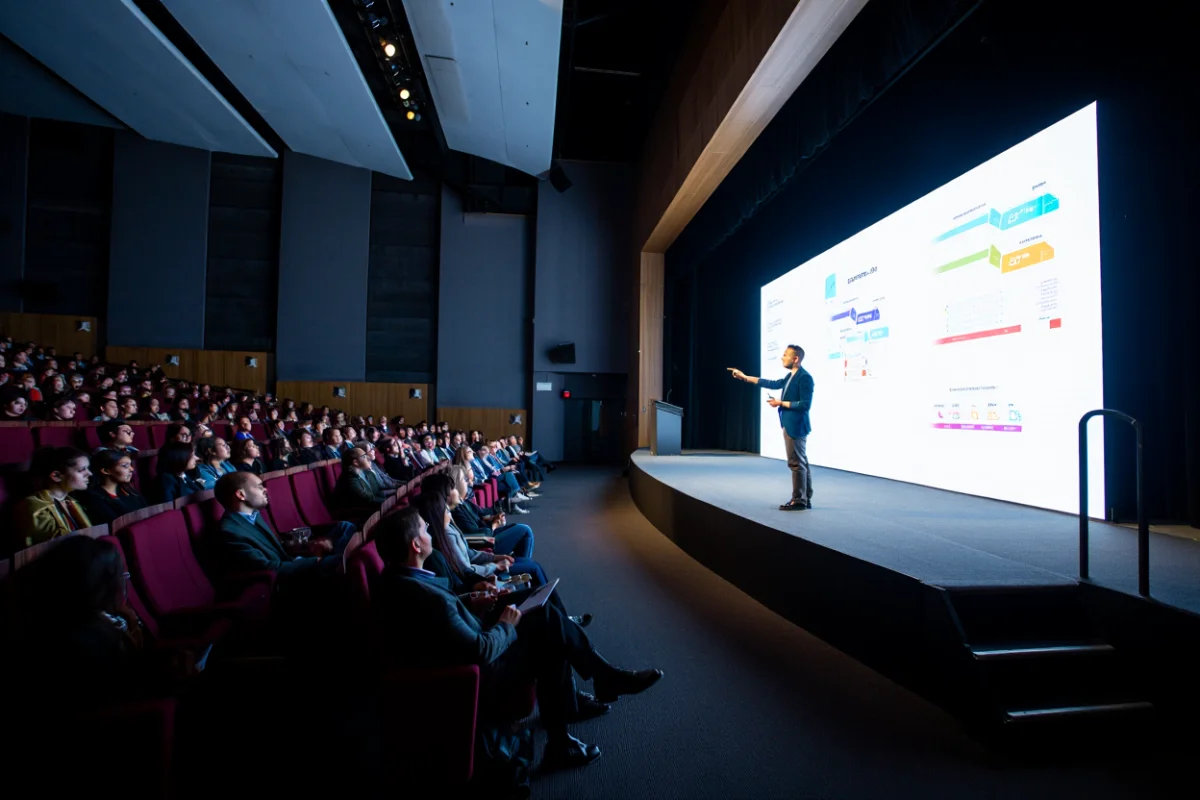
Presentation design
Ready to lift your presentation game? Check out our latest projects, get some inspo, then get in touch.
Document design
When you need reports, proposals, information memorandums, capability statements or tenders to look impressive, we’re the experts who get it done fast and make you look good.
Graphic design
From eye-catching social media pieces, to polished brochures, web design and motion graphics, we’re here to handle all your design needs.
HOW WE HELP
Get your team
on brand
Empower your teams with templates that work as hard as they do. From detailed reports to collaborative proposals and presentations, we help your communications, branding, and marketing teams work smarter, not harder.
Impress
your clients
First impressions count. Impress your clients, stakeholders, and investors with flawless templates designed for tenders, presentations, reports and sales and marketing collateral.
Say goodbye to
Templates that break or go unused
Formatting headaches that waste time and resources
Designs that fail to reflect your brand
SEE THE MAGIC


BEFORE AND AFter
Proof is in the pudding! Check out these before-and-after transformations to see how we turn meh into magic.


who we work with


.svg)
.svg)
.svg)
.svg)


%20(2).avif)


.svg)


The ideaseed difference
We’re fast. Really fast
We know time is of the essence, so we pride ourselves on quick, efficient delivery without sacrificing quality. Whether you have a tight deadline or need a last-minute update, our team is committed to delivering polished results within even the tightest timeframe.
We’re reliable. Always
Our clients trust us because we consistently deliver beautiful, high-quality work. We understand the importance of dependable tools in your business, and we never compromise on quality or functionality.
We go the extra mile
We don’t just meet expectations; we exceed them. We take the time to understand your needs and find creative, tailored solutions that make your work easier and more effective. Our commitment to going above and beyond means you get more than just a template — you get a partner who genuinely cares about your success.